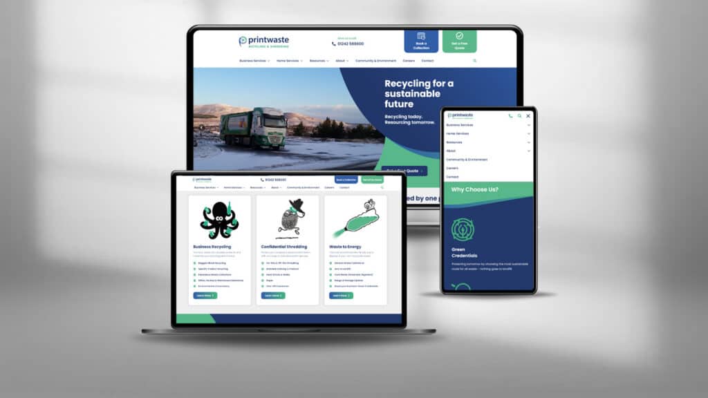
Designing a website that reflects your business is crucial
The number one tip to building the best website you can? Keep it simple. When it comes to user experience (UX), both users and Google favour simplicity. The more concise your content the better.
The psychology of colours
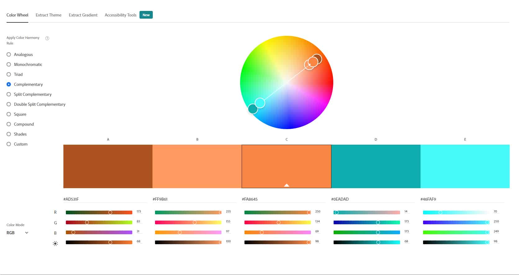
Keep to your brand guidelines, but bear in mind colour psychology! A call to action that’s predominantly red can psychologically deter users from engaging with it. Cool, neutral colours are best here. Nothing too garish.
Bear this in mind when designing your logo.
Why is my choice of logo important?
Your logo forms the foundation of your site, from colours to font families, so it’s vital that you have a good starting point.
If you don’t have a logo at all, simply need yours refreshing, or even just converting to a modern format (SVG or EPS, for example), our expert graphic designers are on hand to help.
PS. A great tool to help you choose your colours for your logo is Adobe Colour Wheel.
Cheesy stock images

The less stock imagery you can use the better. Nothing says more about your business than photos with your own branding, your own team and most importantly your own work.
Stock images do have their place, but where possible, trust in your own photography. It’s far more engaging than, for example, a plumber holding a wrench with a big cheesy American grin.
If stock imagery is necessary make sure it’s relevant to both the focus of your content, and to your location where possible.
Sometimes less is more. Perhaps a contemporary icon set will work better? Maybe some animation? Contact a graphic designer worth their salt, and see what they think.
Go with the flow
While a solid HTML structure probably isn’t on your priority list when you’re building a website for your business, it’s not to be underestimated in Google’s eyes!
- Headers should be structured and to the point. No H1’s in the footer. Follow a hierarchy!
- Does a <div> work better than a <span> for the purpose you’re intending? Will wrapping it in a <p> be better than adding a <br />? (Psst, if you’re unsure, give us a call)
- Are your image file sizes unnecessarily large? Perhaps your hero image doesn’t need to be a 3mb PNG when it could be a 200kb JPG.
Don’t leave the guesswork up to your users

There’s nothing more frustrating than a website where you can’t find the information you need within a few clicks. Don’t make your users guess. Tell them where to go. Give them everything they need instantly.
Even Google appreciates it
Solid URL structures that flow, make sense and direct your users to the info they need will result in better rankings for your website when you run an SEO campaign.
So how do you do it?

- Design your flow before you build
- There’s nothing worse than losing track of yourself half way through a masterpiece. Preparation is everything. Design your user journey, decide where you want people to go.
- Clear, concise calls to action.
- Avoid sending everything through to the contact page. This genericises your intention, and users will drop off compared to a more granular action.
- Think – Do you want your users to call you? Or would you prefer email trails? Which would your users prefer? Example: If you’re an emergency plumber, your users won’t want to fill in a form and wait possibly 24 hours for a response. They want to talk to someone, and get a solution immediately.
- Show the information your customers need.
- Short, snappy bursts of information are far more beneficial than lengthy, long winded paragraphs. Both for your users, and Google!
- Avoid the “get in touch to find out more” approach. If your users can’t find what they need, most will simply “bounce”.
- Grab their attention with engaging titles. No title needs to be 30 words long. Keep it relevant.
- Adaptation!
- Don’t be afraid to change your websites’ structure if you’re finding that users struggle to get to the information they’re after. People won’t stay on your site for long if they can’t immediately see what they want.
- In this age of impatience, and with everything at the click of a button, people expect websites to be “to the point”. If it’s not, they will simply go elsewhere.
- If it adds no value, get rid.
- There is no value to having content that means nothing. You don’t want to write it, your users don’t want to read it.
- This doesn’t just apply to content. If users aren’t utilising your call to action, there’s no reason for it to be there. Try changing it out for a phone number, or simply removing it.
As an agency, we have built thousands of websites between us, and we’re pretty clued in as to what works and what doesn’t. The aim of the game is to make your website as user friendly as possible. Don’t overcrowd it with images, content, CTAs or animations “just because”. Users won’t appreciate it, Google Pagespeed Insights won’t appreciate it. There’s no upside to having redundant content.
Ultimately, your website is your representation of your business. Customers want an approachable, clear, concise business who offer hassle-free solutions, so make sure you are ahead of your competitors.
TL;DR
Plan ahead. Keep it simple. Less is more. Give your users what they want. Your goal is to convert them, not lose them!
A little unsure about the technical side, or simply don’t know where to start? Let our expert web developers take care of the difficult bits, and build the website of your dreams.